Monthly Archives: September 2013

Review: The Trial of the Punisher 1 of 2

Written by Marc Guggenheim
Art by Leinil Yu

ImageI picked this issue thinking that possibly it would be the connection between last year’s Punisher War Zone miniseries and a prequel to the current Thunderbolts series.  I quickly realized this is just a standalone story, yet one that is still firmly set in continuity of the whole Marvel Universe. It is difficult to say when exactly this occurred in continuity, but that feels relatively irrelevant.

ImageI have always enjoyed the Punisher when he was set up as Marvel’s Batman. Not that he’s a costumed dark knight who never kills, but rather even if he’s not the smartest or strongest person in the room he’s methodical enough to always make it out and never rely on luck. When I started reading this comic it became very apparent that this is the character trait that Marc Guggenheim is going for in this Punisher story, which was the same in his War Zone miniseries last year. Marc does a fantastic job building up the drama and delivering an authentic feeling court drama featuring the Punisher. I don’t think I’ve ever read a mainstream comic like this. I’m sure there have been Daredevil comics with intense courtroom drama, but I’ve never read them. Because of that, this feels very fresh and new to me. Marc is also a fantastic writer, and has a great way of crafting dialogue with punctuation and dialect to drive scenes and help you understand the characters. Even without the art, just by reading the dialogue I would not find it difficult to picture this entire comic in my head. He really goes above and beyond in this issue to draw the reader in to the story.

ImageI know I may get some flak for this, but I’ve never entirely enjoyed Leinil Yu’s art. He is a fantastic artist, but I think from the Secret Invasion story line and his artwork on New Avengers prior to that, I never liked how he drew women, especially Spider-Woman. He took an elegant female character and made he feel harsh and scratchy. With that said though, his art work is perfect for this book. He does a great job of making the expressions of characters, especially Frank Castle, subtle yet powerful. Also, with my prior criticism of his work, in this book he makes the strong female character attractive and stays away from making her feel harsh or giving her large angular cleavage.

ImageIf you are a fan of the Punisher, this is a must read for you. Especially if you were a fan in the 90s, and the violent turn taken in the Garth Ennis line of this character’s series wasn’t your favorite spin on the Punisher, this turn back towards moderate, still dark and violent but not gory, storytelling is very enjoyable and feels like a solid continuation on Greg Rucka’s fantastic run.

Rating: 4 out of 5

Tagged , , , , ,

Review: Infinity 3

Written by Jonathan Hickman
Art by Jerome Opeña & Dustin Weaver

Image
Previously in Infinity:

ImageImage

The latest issue in Marvel’s latest event is an excellent issue if you have been paying attention so far. And by paying attention I mean reading Hickman’s Avenger series since the beginning of Marvel NOW. This is not a jump on event, and even though the adjective-less Avengers had a four issue prelude to this event, All 17 issues of that series and all 8 of the New Avengers are vital reads to fully enjoy and understand this series. This event, unlike DC’s current Villains Month, is an event that the dedicated will truly enjoy and comprehend, but may very likely annoy and turn away any casual reader. But that’s kind of what Hickman does.

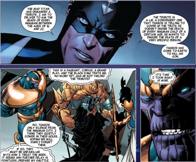
The art for this book is fantastic. Opeña and Weaver’s styles are similar enough that at no point did I feel a disjointed break in the story telling, unlike in the final issue of Age of Ultron. Both are skilled and realistic artists and they do a great job. They are excellent examples of what most fans expect from their art in mainstream comics. They have great power and skill at telling a story which at some points could very easily become convoluted and mismanaged by a weaker artist. There is a page featuring Black Bolt’s simple retort to Thanos that is kept coming back to after I finished reading the book. I’m unsure which artist drew that page (I believe Dustin Weaver), but the layouts, the art, and even the lettering were masterfully done on that page. Even if you don’t want to buy this issue, just thumb towards the back at your local LCS and you’ll see what I’m talking about.

As for the story that Hickman is writing, to be honest I’m not a huge fan of this builders story. I feel that there is grandeur and an epic nature to this narrative that is eluding me somehow. Yet, the story built from the New Avengers is one of the greatest stories I read since Abnett and Lanning left Guardians of the Galaxy several years ago. So with an issue focusing predominately on the galactic battle between the Avengers and the Builders, I found much more interest in the shorter second half of the story featuring Thanos and Black Bolt. This is also an obvious lead-in to the Inhumans series coming out in December. It really disappoints me that Marvel is already pushing that series into the mix before this story even dropped. It could have had so much more power if they had just waited a few weeks. But that’s my issue with their marketing not with Hickman’s writing.

Hickman, as usual, feels slightly aloof in his writing. He gives you enough information to follow the story but infamously drops other pieces of information that you are left either clueless or only partially aware. His writing is not for a lazy reader, but that isn’t to say that if you don’t like him you’re a lazy reader. Reading Hickman is like going on a road trip when you don’t know the destination. At some point you have to just enjoy the journey and hope the ending is worth all the time.

ImageRating 4 out 5

Tagged , , , , , , , , ,

Infinity: The Hunt 01 (of 04)

Written by Matt Kindt
Art by Steven Sanders

Image

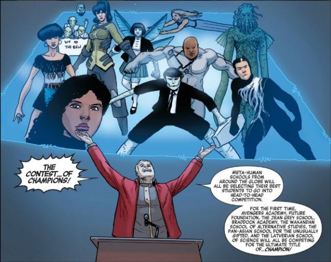
What starts as an apparent homage to the classic 1982 series Contest of Champions and a slight rip-off of the currently ongoing series Avengers Arena turns out to be a very basic introduction to a youth based look at Marvel’s Infinity event. While groups from around the globe make up the group, the majority still are local groups from North America adding familiarity to manyof the characters if you have read Avenger Academy, Wolverine and the X-Men, or FF. To those of you who are very in tuned with the Marvel universe continuity the appearance of Meggan, Jimmy Woo, and Sanjar Naveed (we all thought he was dead too) is enjoyable.

Image

This, as said above, is a very simple introduction to the characters assumed to be the focus of this four part miniseries. If you aren’t completely aware of any of the characters or haven’t paid attention to any of their series lately, the issue does a perfect job of simply reintroducing you so as the series moves forward you can sit back and enjoy the action and story. It feels almost retro compared to the way so many other current first issues pan out. There is no time jump and no introduction of a character whose name you don’t know. This is a very straight forward issue. I enjoyed it for that reason, but I am sure many will dislike it for that exact reason.

Image

Matt Kindt doesn’t hit it out of the park with this issue in terms of writing. There is nothing ground breaking and there are no huge twists and turns. This is a very classic feeling comic and with the setup of a comparison to the Contest of Champions it only helps drive the idea that this is completely intentional. With all of the youth characters in this issue, Matt Kindt does a great job of making a perfect introduction issue to a wide spectrum of the Marvel universe to many potential young and future comic enthusiasts. But because of this many who didn’t grow up reading Marvel and DC comics in the 70s and early 80s, but rather got into comics under the darker and more mature tones of the past thirty years, may not enjoy this book or Matt Kindt’s style of writing for this issue.

Image

In terms of Steven Sanders’ art he does nothing revolutionary but rather sticks to a simple layout which also plays into a retro feel of the entire issue. His double page spread of the Avengers Academy campus (with numbered directory) threw me back to all the classic annual’s which featured the same types of maps and layouts as supplemental information to the story. Sanders’ art has a classic John Byrne meets Archie feel which again adds to the theme I keep going back to.

Image

I can’t recommend this issue to everyone, but I do especially recommend this issue to any who are looking for modern superhero comics that are in continuity which are also appropriate for most ages.

Rating: 3.5 out of 5

Tagged , , , , , , , ,

Superior Spider-Man 017

Written by Dan Slott and Pencils by Ryan Stegman
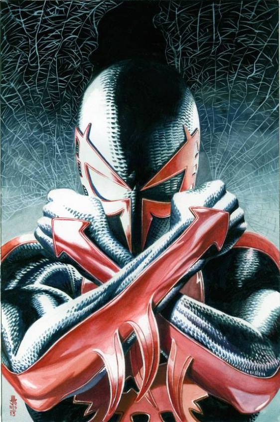
Variant Cover by J. G. Jones
ImageImage
Review by cannoncanvas

This issue marks a landmark for those of us that either loved the old 2099 series from the mid-90s or played the recent Spider-Man video games not based on a movie. This issue is the return of Miguel O’Hara, Spider-Man 2099, and his introduction into Marvel’s 616 universe.

If you have been following Spider-Man since his recent conversion you have probably read an issue drawn by Ryan Stegman. While I don’t believe he is the greatest artist Marvel has in their arsenal, Stegman has a great skill with his style of taking what could be a much darker and more violent comic series and making it still feel fun and light. This is essential in the current story because although nothing about the series is like the old Spider-Man, there is a whimsy to the art which ties us back to before Doc Ock took over Pete’s body.
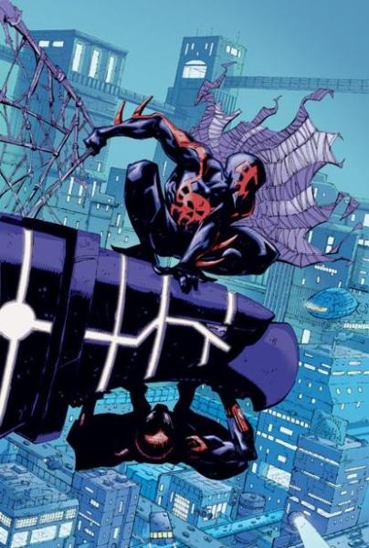
Ryan Stegman does a great job as always in this issue. His transitions from the Goblin’s Lair to a loft looking area inside of Horizon labs have him changing up the style in subtle ways where the Goblin’s lair has a more extreme and cartoonish look with the villains to a slightly more realistic feel during the meeting in Horizon Labs. One of the more impressive pages of this book is a large two page splash reintroducing Spider-Man 2099 in costume. It is incredibly dramatic, and is a great start to this issue.
If you have not enjoyed his work up to this point, for whatever reason you may have, I am sorry to say he is still with this title.

As for the writing and the actual plot of the book, I’ve enjoyed Slott’s run on Spider-Man so far even though he has broken my heart more times than I care to count. I don’t like what he’s done with the character, but after 1000+ in-continuity solo issues, Slott found an original story line and has made it gripping and it is well thought out.

[Warning: Spoilers] This book starts out with a quick reintroduction to Spidey’s 2099 world. He reintroduces us quickly to several of this Spider-Man’s different powers, to Alchemax (pay attention to that name, kiddies), Tyler Stone, and to the rewrite of vulgarities Peter David created back in 1992. As the story starts, Spider-Man 2099 must go back in time to save his father (who doesn’t know he’s his father), Tyler Stone, who is disappearing inside the time stream from the past being altered by all those idiots in the Heroic Age. This also bears a surprisingly similar plot point to X-Men: Battle for the Atom, also out this week.
The latest Green Goblin, whose secret identity is still technically unknown (hint: it’s probably Tiberius Stone), is mad at Ulrich for being a generally horrible Hobgoblin. Tiberius Stone with Liz Allen also purchases Horizon Labs along with all of Peter (Otto) Parker’s (Octavius’) Spider-Man tech. This makes him mad which leads him to change into the Superior Spider-Man and go after Tiberius. So Spider-Man 2099 goes back in time to 2013, and is in Horizon Labs which turns out to be at the same location Alchemax in the future. This was a nice tie to the two timelines, which sets up an obvious plot, but that’s okay. Ultimately 2099 sees Superior threatening Stone and the issue ends with a poised confrontation between the two Spider-Men. [Warning: Spoilers Done]

To be honest, as much as I enjoyed seeing Spider-Man 2099 again, and I’m excited to read the rest of this storyline, I can’t help but feel this was a fairly rushed issue with very little substance. It is not a bad issue, and not the worst so far in Slott’s long Spider-Man run, but I feel in the grand scheme this is a throw away issue to get some exposition out of the way so we can move the story along in other issues. This is often needed, so I don’t want to make it sound like this was an awful issue, just definitely not the best so far (and hopefully, not to come).

I’m wondering why Marvel has decided to use so many time traveling stories all at once across their Universe. They have to know their fans are smart and diverse enough readers to be reading all of these books at once, and with such similar plots and almost clichéd ideas about time travel are they going to bore those fans? I mean, jammit, man. What the shock?

Rating: 3 out of 5

Tagged , , , , , ,